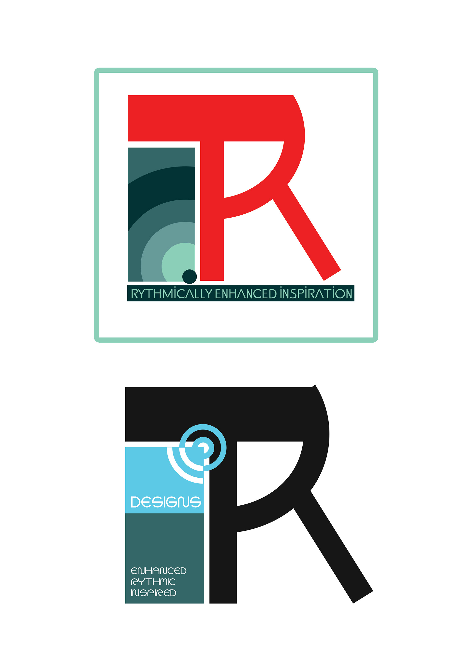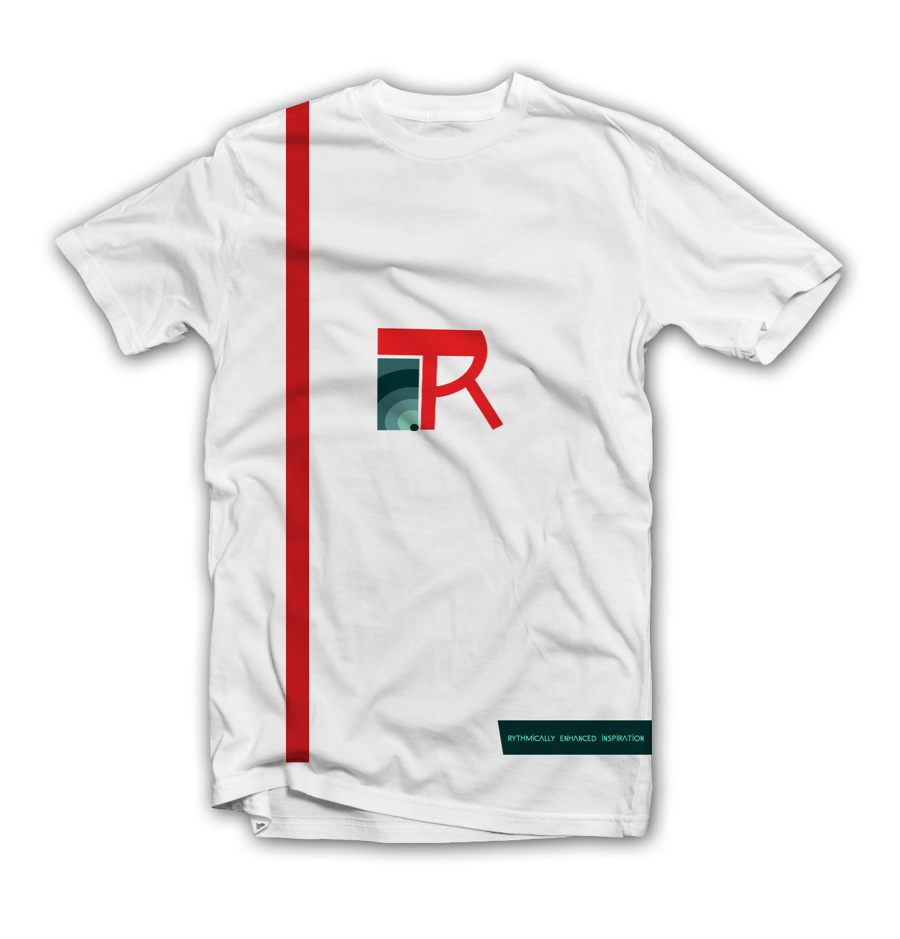
After years of stagnation and many iterations here is the rebranding of my portfolio identity. Tirita (which in Amharic means Rythm or Beat) is a brand that I had been building for quite sometime, this year I am aiming to turn it into something more concrete and enable it to bud into something more established, and hence the redesign. The TR is short for Tirita and is something I did from scratch, the circles contained within the box represent the amount of growth that I have witnessed as a creative and my wish to channel that growth into more products. I used the SS.ADEC2.0 TEXT font for the tag line and various text within the mockup because i like its simplicity and straightforwardness. The colors that I chose are Red for the passion I feel for the field and the various shades of grey and blue for the discipline and level head nature this passion should be handled in.